Monday’s announcement from the World Health Organization, declaring red meat to be a “probable carcinogen” has dominated the nutrition news cycle this week. I’m already tired of talking about it so I won’t belabor it here. For those who are just catching up, my response to Monday’s announcement appears on the Huffington Post. You can also hear my interview on Maryland’s NPR station and join the discussion on the Nutrition Diva Facebook page.
Instead, let’s talk about risk and how our perception of it is influenced by the way it’s presented, both verbally and visually.
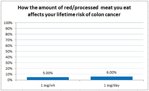
As we’ve been talking about all week, some analyses suggest that people who eat 1 serving of red or processed meat per day have a 20% increased risk of colon cancer, compared to those who eat 1 serving per week. (Note that those who eat red or processed meat only once a week are in the same risk category as those who never eat it.)
Here’s one way of showing that data.
Does it look any less threatening if we change the color from red to blue?
What happens if we present the same data like this?
The first two graphs focus on the relative risk, the difference between the two. The third graph also shows the absolute risk, or how likely either of these two outcomes are.
Isn’t it fascinating what different responses the same data can elicit, depending on how they’re presented?


Thank you Monica for your balanced perspective. I like my steak medium-rare.